Why Responsive Backgrounds are Crucial for Modern Websites
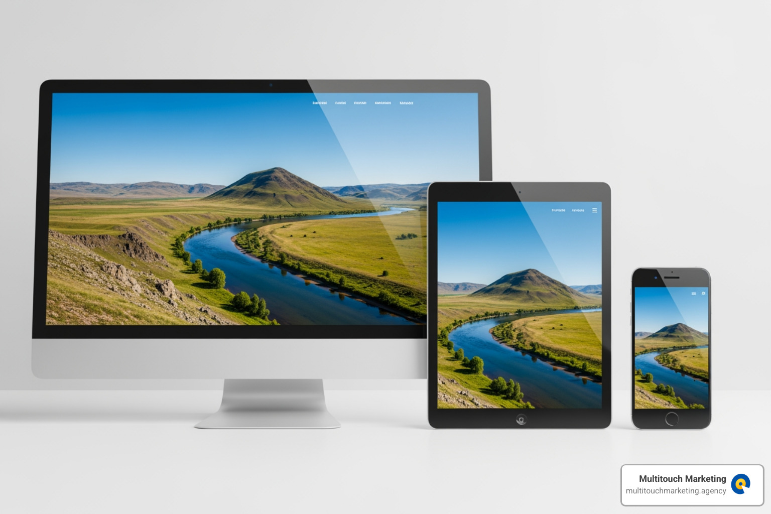
Responsive web design background images are essential for ensuring your website’s hero sections and background visuals display perfectly across all devices. Here’s how to implement them effectively:
Quick Implementation Guide:
- Use
background-size: cover– Scales images to fill the entire container while maintaining aspect ratio. - Apply media queries – Serve smaller images (e.g., 480px for mobile, 1920px for desktop) based on screen width.
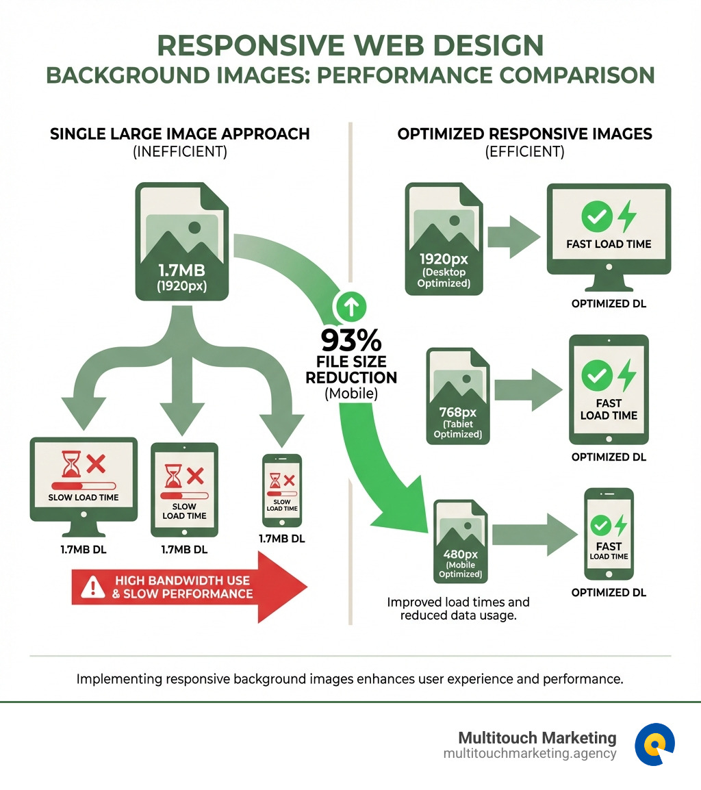
- Optimize file sizes – Compress images to reduce load times by up to 93% (e.g., from 1.7MB to 114KB).
- Set fallback colors – Add
background-colorfor content visibility while images load. - Center images – Use
background-position: center centerto keep focal points visible.
Why This Matters:
Background images can significantly impact your website’s performance. Research shows that 40% of users leave a site if it takes longer than 3 seconds to load. A single, large background image served to all devices wastes bandwidth on mobile and can dramatically slow your page speed—a factor Google uses in its search rankings. Properly optimized, responsive images lead to faster load times, better user engagement, and improved SEO.
Explore more about responsive web design background images:
- responsive web design for all devices
- responsive web design for beginners
- responsive web design and search engine optimization
The Foundation: Core CSS Properties for Responsive Backgrounds
When we set out to create beautiful, dynamic websites for our clients in Raleigh, Durham, or Chapel Hill, we know that eye-catching visuals are key. Often, this means using a striking background image. The magic of making these images adapt to any screen lies primarily in a handful of core CSS properties. These properties allow us to control how a background image scales, positions itself, and behaves, ensuring a seamless experience for every user, whether they’re on a desktop monitor or a smartphone. If you’re looking for broader strategies, check out our insights on Responsive Web Design Techniques.
Understanding background-size, position, and attachment
Let’s explore the essential CSS toolkit for responsive background images:
-
background-image: This is where it all begins. We use this property to specify the URL of the image we want to use as a background..hero-section { background-image: url('path/to/your/image.jpg'); } -
background-size: This is arguably the most crucial property for responsiveness. It dictates how the image scales relative to its container. For a typical full-screen background,coveris our go-to..hero-section { background-image: url('path/to/your/image.jpg'); background-size: cover; /* This makes it responsive! */ } -
background-position: An image might scale differently across devices, and we want to ensure the most important part of the image remains visible. This property allows us to precisely control the image’s starting position within its container. For most responsive web design background images, centering the image (center center) is the safest bet to keep the focal point visible..hero-section { background-image: url('path/to/your/image.jpg'); background-size: cover; background-position: center center; /* Keeps the image centered */ } -
background-repeat: Unless we’re deliberately creating a tiled pattern, we almost always want to prevent the background image from repeating. Setting this tono-repeatensures our image appears just once..hero-section { background-image: url('path/to/your/image.jpg'); background-size: cover; background-position: center center; background-repeat: no-repeat; /* No annoying tiling */ } -
background-attachment: fixed: This property creates a visually appealing parallax-like effect where the background image stays fixed in the viewport while the content scrolls over it. It can add a layer of sophistication to your design, but use it with care, as it can sometimes affect performance on older or less powerful devices..hero-section { background-image: url('path/to/your/image.jpg'); background-size: cover; background-position: center center; background-repeat: no-repeat; background-attachment: fixed; /* For that cool parallax scroll */ } -
background-colorfallback: This is a small but mighty best practice. While our beautiful background image loads, or if it fails to load for any reason, a fallbackbackground-colorensures that the content remains visible and the user experience isn’t jarring. It also helps prevent flashes of unstyled content..hero-section { background-color: #333; /* A dark fallback color */ background-image: url('path/to/your/image.jpg'); background-size: cover; background-position: center center; background-repeat: no-repeat; background-attachment: fixed; }For a more comprehensive look at how these properties interact, you might find this perfect full-page background image guide insightful.
cover vs. contain vs. 100% 100%: What’s the Difference?
Understanding the nuances of background-size is key to mastering responsive web design background images. While cover is often the default choice for full-viewport backgrounds, contain and 100% 100% offer different behaviors that are useful in specific scenarios. Let’s break them down:
| Property Value | Scaling Behavior | Aspect Ratio Maintenance | Potential Cropping / Distortion |
|---|---|---|---|
cover |
Scales the image to completely cover the container. | Yes | Parts of the image may be cropped. |
contain |
Scales the image to fit entirely within the container. | Yes | May leave empty space (letterboxing). |
100% 100% |
Stretches the image to fill the container’s exact dimensions. | No | The image will be distorted. |
Introduction: Why Responsive Backgrounds are Crucial for Modern Websites
Responsive web design background images are essential for ensuring your website’s hero sections and background visuals display perfectly across all devices. Here’s how to implement them effectively:
Quick Implementation Guide:
- Use
background-size: cover– Scales images to fill the entire container while maintaining aspect ratio - Apply media queries – Serve smaller images (e.g., 480px for mobile, 1920px for desktop) based on screen width
- Optimize file sizes – Compress images to reduce load times by up to 93% (e.g., from 1.7MB to 114KB)
- Set fallback colors – Add
background-colorfor content visibility while images load - Center images – Use
background-position: center centerto keep focal points visible
Why This Matters:
Background images can significantly impact your website’s performance. Research shows that 40% of users leave a site if it takes longer than 3 seconds to load. A single large background image served to all devices wastes bandwidth on mobile and can dramatically slow your page speed, a factor Google uses in its search rankings.
I’m Milton Brown, and since 2008 I’ve optimized digital campaigns for organizations with budgets ranging from $20,000 to $5 million, where implementing responsive web design background images has been critical to improving landing page performance and conversion rates. My experience managing paid media across multiple industries has shown that fast-loading, visually appealing pages directly impact campaign ROI and user engagement.
Explore more about responsive web design background images:
- responsive web design for all devices
- responsive web design for beginners
- responsive web design and search engine optimization
The Foundation: Core CSS Properties for Responsive Backgrounds
When we set out to create beautiful, dynamic websites for our clients in Raleigh, Durham, or Chapel Hill, we know that eye-catching visuals are key. Often, this means using a striking background image. The magic of making these images adapt to any screen lies primarily in a handful of core CSS properties. These properties allow us to control how a background image scales, positions itself, and behaves, ensuring a seamless experience for every user, whether they’re on a desktop monitor or a smartphone. If you’re looking for broader strategies, check out our insights on Responsive Web Design Techniques.
Understanding background-size, position, and attachment
Let’s explore the essential CSS toolkit for responsive background images:
-
background-image: This is where it all begins. We use this property to specify the URL of the image we want to use as a background..hero-section { background-image: url('images/hero-background.jpg'); } -
background-size: This is arguably the most crucial property for responsiveness. It dictates how the image scales relative to its container. For a typical full-screen background,coveris our go-to..hero-section { background-image: url('images/hero-background.jpg'); background-size: cover; /* This makes it responsive! */ } -
background-position: An image might scale differently across devices, and we want to ensure the most important part of the image remains visible. This property allows us to precisely control the image’s starting position within its container. For most responsive web design background images, centering the image (center center) is the safest bet to keep the focal point visible..hero-section { background-image: url('images/hero-background.jpg'); background-size: cover; background-position: center center; /* Keeps the image centered */ } -
background-repeat: Unless we’re deliberately creating a tiled pattern, we almost always want to prevent the background image from repeating. Setting this tono-repeatensures our image appears just once..hero-section { background-image: url('images/hero-background.jpg'); background-size: cover; background-position: center center; background-repeat: no-repeat; /* No annoying tiling */ } -
background-attachment: fixed: This property creates a visually appealing parallax-like effect where the background image stays fixed in the viewport while the content scrolls over it. It can add a layer of sophistication to your design, but use it with care, as it can sometimes affect performance on older or less powerful devices, especially on mobile. For mobile, we often switch this toscrollwithin a media query for better performance..hero-section { background-image: url('images/hero-background.jpg'); background-size: cover; background-position: center center; background-repeat: no-repeat; background-attachment: fixed; /* For that cool parallax scroll */ } -
background-colorfallback: This is a small but mighty best practice. While our beautiful background image loads, or if it fails to load for any reason, a fallbackbackground-colorensures that the content remains visible and the user experience isn’t jarring. It also helps prevent flashes of unstyled content..hero-section { background-color: #333; /* A dark fallback color */ background-image: url('images/hero-background.jpg'); background-size: cover; background-position: center center; background-repeat: no-repeat; background-attachment: fixed; }For a more comprehensive look at how these properties interact, you might find this perfect full-page background image guide insightful.
cover vs. contain vs. 100% 100%: What’s the Difference?
Understanding the nuances of background-size is key to mastering responsive web design background images. While cover is often the default choice for full-viewport backgrounds, contain and 100% 100% offer different behaviors that are useful in specific scenarios. Let’s break them down:
| Property Value | Scaling Behavior | Aspect Ratio Maintenance | Potential Cropping / Distortion |
|---|---|---|---|
cover |
Scales the image to completely cover the container. | Yes | Parts of the image may be cropped. |
contain |
Scales the image to fit entirely within the container. | Yes | May leave empty space (letterboxing). |
100% 100% |
Stretches the image to fill the container’s exact dimensions. | No | The image will be distorted. |
Optimizing Responsive Web Design Background Images for Performance
We understand that a website’s beauty shouldn’t come at the cost of its speed. This is especially true for responsive web design background images, which can be significant contributors to page load time. Optimizing these images is not just a technical detail; it’s a critical component of user experience (UX) and search engine optimization (SEO).
Imagine a beautiful background image on your desktop, perhaps 5500x3600px, which could easily be a 1.7MB file. Now imagine a user in Raleigh, Durham, or Chapel Hill accessing that same site on their mobile phone with a slower connection. They’re downloading a massive file they don’t need, leading to frustrating delays. This is where optimization truly shines. We’ve seen cases where simply resizing an image down to 768x505px and applying optimization reduced the file size from 1741KB to a mere 114KB. That’s a staggering 93% reduction in file size!
Such improvements directly impact page speed, which is a core metric for Google’s Core Web Vitals. A faster Largest Contentful Paint (LCP) score, indicating how quickly the largest content element (often a background image) becomes visible, means a better user experience and potentially higher search engine rankings. Our expertise in Responsive Web Design and Search Engine Optimization consistently highlights this connection.
Using Media Queries to Serve Different Images
The most effective way to optimize responsive web design background images is to serve different image files based on the user’s screen size. This is where CSS @media rules, commonly known as media queries, become our best friend. Media queries allow us to apply specific styles, including different background images, only when certain conditions are met, such as the viewport width.
Instead of forcing every device to download the massive desktop image, we can define “breakpoints” where the website’s layout and assets should adapt. For instance, we might have one image for large desktop screens, another for tablets, and a much smaller, optimized version for mobile phones. This ensures that a mobile user in Chapel Hill isn’t downloading desktop-sized assets, saving them data and speeding up their experience. For more on defining these crucial points, explore our guide on Responsive Web Design Breakpoints.
Here’s a practical example of how we use media queries to serve different background images:
/* Default background for large screens (desktops and above) */
body {
    background-image: url('images/hero-desktop.jpg');
    background-size: cover;
    background-position: center center;
    background-repeat: no-repeat;
    background-attachment: fixed; /* Can be changed for mobile performance */
    background-color: #e0e0e0; /* Fallback */
}

/* Media query for tablets (e.g., screens up to 1024px wide) */
@media only screen and (max-width: 1024px) {
    body {
        background-image: url('images/hero-tablet.jpg'); /* Load a medium-sized image */
        background-attachment: scroll; /* Often better for tablet performance */
    }
}

/* Media query for mobile devices (e.g., screens up to 767px wide) */
@media only screen and (max-width: 767px) {
    body {
        background-image: url('images/hero-mobile.jpg'); /* Load the smallest image */
        background-attachment: scroll; /* Essential for mobile performance */
    }
}
In this setup, the browser will only download the background-image specified by the most appropriate media query. This drastically reduces the data transfer for users on smaller devices, leading to a much faster loading experience.
Best Practices for Image Preparation
Even with clever CSS, the quality of our responsive web design background images ultimately depends on how well we prepare them. This involves careful consideration of image compression, file formats, and dimensions.
-
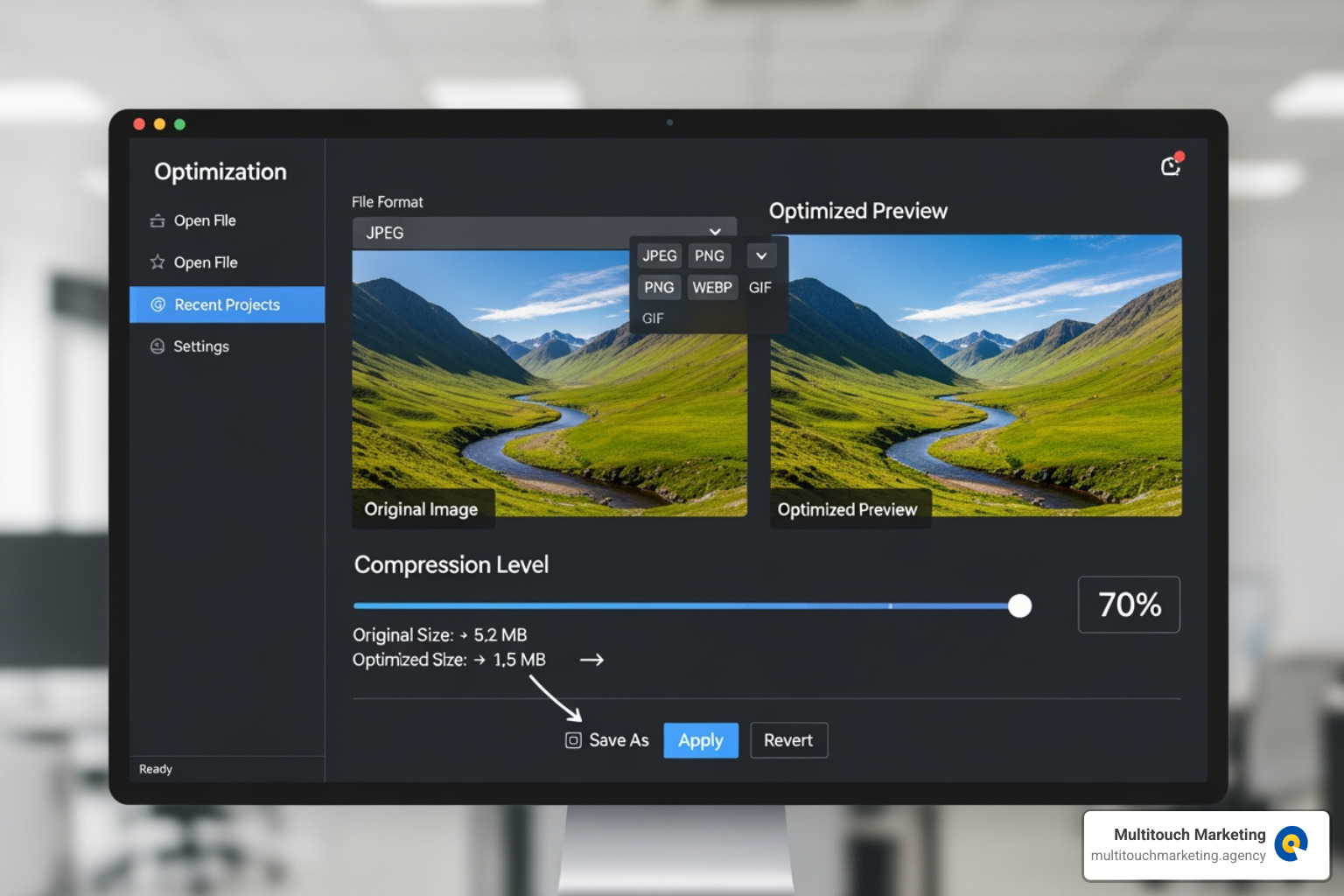
Image Compression: This is non-negotiable. Before uploading any image to your website, it must be compressed. We aim for the lowest possible file size without sacrificing visual quality. There are many fantastic image optimization tools available. One of our favorites is the free Squoosh app, which allows us to experiment with different compression levels and formats and supports next-generation image formats like WebP and AVIF.
-
Choosing File Formats:
- JPEG: Ideal for photographs and images with many colors and gradients. They offer excellent compression for complex visuals. For even faster perceived loading, use progressive JPEGs.
- PNG: Best for images with transparency or sharp lines, like logos or graphics. However, PNGs can have larger file sizes than JPEGs for photographic content.
- WebP & AVIF: These are modern, next-generation image formats that offer superior compression and quality compared to JPEGs and PNGs. They can significantly reduce file sizes, further boosting performance, especially for our clients’ sites in North Carolina where fast loading is paramount. We always try to serve these formats first, with JPEGs/PNGs as fallbacks.
-
Image Dimensions: We shouldn’t just scale down a single large image. Instead, we should create multiple versions of our background images at different dimensions to match our breakpoints. For instance, if our desktop image is 1920px wide, we might create a 1024px version for tablets and a 767px or 480px version for mobile. The key is to start with a high-resolution source image (e.g., 5500x3600px to cover most widescreen monitors) and then scale down. This prevents pixelation when images are scaled up on larger screens.
By carefully preparing our images, we ensure that our responsive background images look stunning and load swiftly, contributing to a smooth and enjoyable user experience for everyone.
Advanced Solutions for Responsive Backgrounds
While core CSS properties and media queries are powerful, modern web development offers more advanced tools for handling responsive web design background images. These solutions help you tackle complex scenarios and further improve performance.
Implementing responsive web design background images with image-set()
The CSS image-set() function is a more modern way to handle responsive images directly within your CSS. It allows the browser to choose the most appropriate image from a provided list, based on factors like screen resolution (pixel density) and support for newer image formats like WebP.
Here’s how you can use image-set() to provide different resolutions and formats:
.hero-section {
    background-image: -webkit-image-set( /* Vendor prefix for broader support */
        url('images/hero-1x.webp') 1x type('image/webp'),
        url('images/hero-2x.webp') 2x type('image/webp'),
        url('images/hero-1x.jpg') 1x, /* JPEG fallback for standard displays */
        url('images/hero-2x.jpg') 2x  /* JPEG fallback for Retina displays */
    );
    background-image: image-set( /* Standard syntax */
        url('images/hero-1x.webp') 1x type('image/webp'),
        url('images/hero-2x.webp') 2x type('image/webp'),
        url('images/hero-1x.jpg') 1x,
        url('images/hero-2x.jpg') 2x
    );
    background-size: cover;
    background-position: center center;
    background-repeat: no-repeat;
    background-color: #e0e0e0; /* Fallback color */
}
In this example, the browser will first try to load the WebP version of the image. If it can’t, it will fall back to the JPEG. It also selects the 2x version for high-resolution (Retina) displays. This ensures optimal image quality and performance. For more details, see The image-set() CSS function on MDN.
When to Use HTML’s
While CSS background images are great for decoration, the HTML
Use the
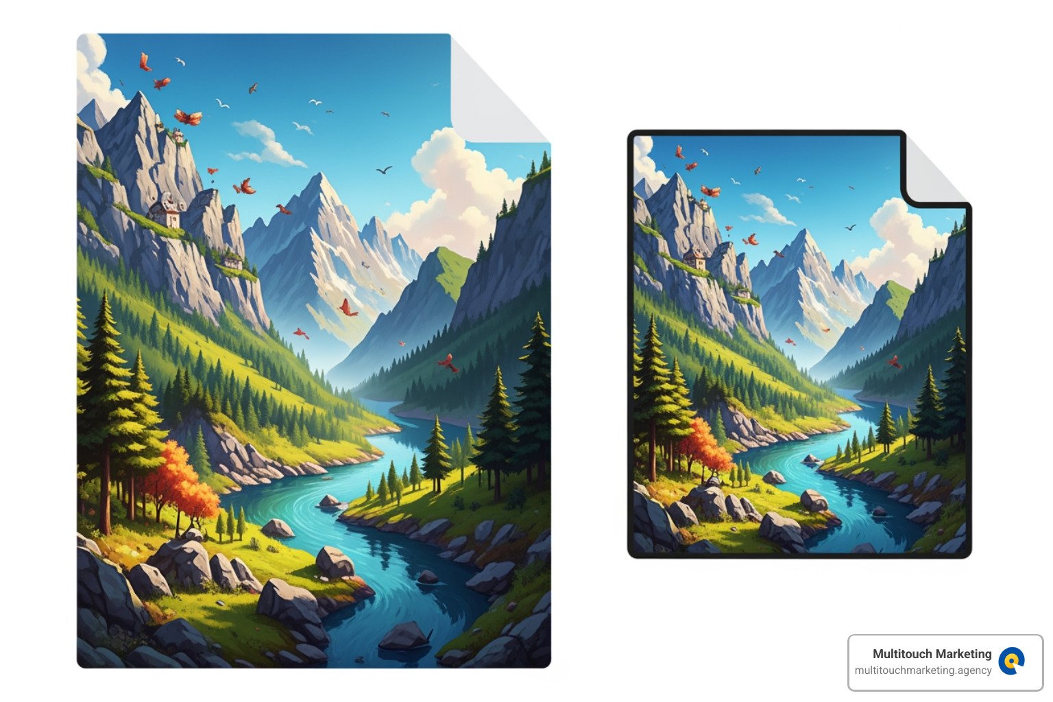
- Art Direction: To show different crops or versions of an image on different screen sizes. For example, a wide landscape photo on desktop can be a tightly-cropped portrait on mobile.
- Format Support: To provide modern formats like WebP or AVIF with fallbacks to JPEG or PNG for older browsers.
- Accessibility & SEO: Since
alttext, which is crucial for screen readers and search engine crawlers.
Here’s an example of art direction using the
<picture>

    <source media="(min-width: 1024px)" srcset="images/hero-landscape.webp" type="image/webp">
    <source media="(min-width: 1024px)" srcset="images/hero-landscape.jpg" type="image/jpeg">


    <source media="(min-width: 768px)" srcset="images/hero-square.webp" type="image/webp">
    <source media="(min-width: 768px)" srcset="images/hero-square.jpg" type="image/jpeg">


    <source media="(max-width: 767px)" srcset="images/hero-portrait.webp" type="image/webp">
    <source media="(max-width: 767px)" srcset="images/hero-portrait.jpg" type="image/jpeg">


    <img src="images/hero-landscape.jpg" alt="A beautiful scenic view, optimized for various devices" loading="lazy">
picture>
The browser will pick the first
Frequently Asked Questions about Responsive Background Images
We often get questions from our clients in North Carolina about the best way to handle responsive web design background images. It’s a topic with many nuances, and getting it right can significantly impact user experience and website performance. Let’s address some of the most common inquiries.
What is the best size for a responsive background image?
There’s no single “best” size, as it depends on the user’s device. The goal is to serve an image that’s just large enough for the screen it’s on, without wasting bandwidth. A good strategy includes:
- Starting with a high-resolution source: Begin with a large image (e.g., 2500px wide or more) to ensure quality on big screens.
- Creating multiple versions: Save different sizes for various breakpoints. A common setup is:
- Desktop: 1920px wide
- Tablet: 1024px wide
- Mobile: 767px wide
- Optimizing each version: Compress every image to reduce its file size as much as possible without a noticeable loss in quality.
The goal is to deliver “only the pixels that the user’s device can actually use,” as a 290 × 183 pixel image (18 KB) looks identical to a 1940 × 1229 pixel image (452 KB) on an iPhone.
How do I prevent my background image from being cropped?
Cropping is a natural part of making a single image fit multiple screen sizes, especially when using background-size: cover. Here’s how to manage it:
- Use
background-size: coverfor full-screen backgrounds: This property ensures the image always covers the entire container, which may crop the edges. Usebackground-position: center center;to keep the most important part of the image in view. - Use
background-size: containto see the whole image: This will fit the entire image within the container, but it may create empty space (letterboxing) if the aspect ratios don’t match. - Choose your images wisely: The best approach is to select background images where the main subject is centered, so cropping the edges on different screen sizes won’t remove anything critical.
How does this impact my website’s SEO?
Optimizing your responsive web design background images has a direct and positive impact on SEO.
- Faster Load Times: Optimized images reduce page load time, which is a key ranking factor for Google. A faster site improves user experience and lowers bounce rates.
- Improved Core Web Vitals: A quick-loading background image directly improves your Largest Contentful Paint (LCP) score, a critical metric for user experience.
- Better Mobile-Friendliness: Google prioritizes mobile-friendly websites. Serving appropriately-sized images to mobile users is a core part of a good mobile experience.
A fast, responsive website with well-managed images not only looks professional but also performs better in search engine rankings. For a deeper dive, read our article on Responsive Web Design SEO.
Conclusion: Deliver a Perfect Visual Experience on Every Device
Mastering responsive web design background images is essential for creating a modern, high-performing website. By using core CSS properties like background-size: cover, implementing media queries for different devices, and optimizing your image files, you can ensure a great user experience on any screen.
A fast-loading, visually appealing site isn’t just about aesthetics—it’s about performance. It reduces bounce rates, improves your SEO, and ultimately drives better results for your business. As PPC experts, we at Multitouch Marketing know that a well-optimized landing page is the foundation of a successful campaign.
Ready to transform your website’s visual appeal and performance? Get a high-performance site with our Responsive Web Design services.


