Why Your Website Must Win on Mobile
Mobile friendly website design is no longer optional—it’s the baseline for online success. Here’s what you need to know.
Key Elements of Mobile-Friendly Design:
- Responsive Layout – Automatically adapts to any screen size.
- Fast Loading Speed – Pages load in under 3 seconds.
- Touch-Optimized Interface – Large buttons (48×48 pixels minimum) and easy navigation.
- Readable Text – Minimum 16px font size without zooming.
- Simplified Navigation – Clear menus, often using hamburger icons.
- Mobile-First Indexing – Google ranks your mobile site first.
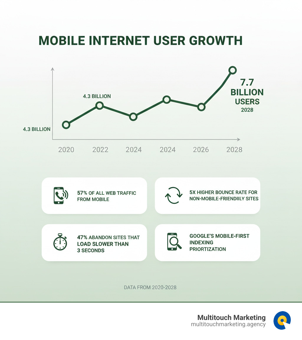
The numbers are clear: mobile devices drive 57% of all website traffic. A non-mobile-friendly site makes visitors 5 times more likely to leave. Worse, 47% of users abandon a site that takes more than 2 seconds to load, with each second of delay potentially cutting conversions by 7%.
Your website is your digital first impression. Mobile users expect immediate answers and a smooth experience. If your site is clunky on mobile, they’ll quickly move to a competitor.
With more than half of all Google searches now happening on mobile devices, Google adapted. It now uses mobile-first indexing, meaning your mobile site is prioritized for ranking in search results.
I’m Milton Brown, and since 2008, I’ve managed digital marketing campaigns for businesses in e-commerce, healthcare, and higher education. My experience managing budgets from $20,000 to $5 million has consistently shown that a strong mobile experience is crucial for supporting paid media goals and maximizing ROI.
The Core Principles of Mobile Friendly Website Design
Creating a mobile friendly website design isn’t about shrinking your desktop site. It’s about reimagining the experience for a user scrolling with their thumb, expecting everything to work seamlessly.
Building for the Thumb: Layout and User Experience
We steer our phones with our thumbs, a simple fact that should guide all mobile design.
- Thumb-Friendly Design: Place the most important buttons and links where thumbs naturally rest—the bottom half and center of the screen.
- Single-Column Layout: This keeps content flowing in one direction, making it easy to scan and scroll. No one wants to swipe horizontally to read.
- White Space & Hierarchy: Use ample white space to avoid a cramped feel and a clear visual hierarchy to guide the user’s eye to the most important information first.
- Simplified Navigation: Complex desktop menus are a nightmare on mobile. The hamburger menu has become a standard because it tucks away navigation, keeping the screen clean.
For more insights into creating effective layouts that convert, check out our Website Design Tips.
The Need for Speed: Performance and Image Optimization
On mobile, speed is make-or-break. Nearly half of visitors will leave if a page doesn’t load in 3 seconds, and each second of delay can drop conversions by 7%. Google also uses page load time as a ranking factor.
The biggest culprit is often large images. Key solutions include:
- Image Compression: Reduce file sizes without sacrificing quality.
- Modern Formats: Use WebP to cut image sizes by up to 30%.
- Responsive Images: The
<picture>element serves smaller images to phones and larger ones to desktops.
Other speed optimizations include code minification (stripping unnecessary characters from CSS/JavaScript) and browser caching (storing files so returning visitors load faster). A Content Delivery Network (CDN) can also dramatically cut load times by serving content from servers near the visitor.
These strategies are part of smart Website Maintenance best practices.
Best practices for an effective mobile friendly website design
Beyond layout and speed, small details create an effortless experience.
- Readable Typography: Use clear sans-serif fonts. Body text should be at least 16px to avoid pinching and zooming.
- Large, Tappable CTAs: Buttons need to be at least 48×48 pixels so they are easy to tap with a thumb. Give them space to prevent accidental clicks.
- Simplified Forms: Long forms are abandoned on mobile. Ask for essential information only and use correct input types (e.g.,
type="tel") to bring up the right keyboard. - Avoid Intrusive Pop-ups: Full-screen pop-ups are frustrating on mobile and can lead to Google penalties. If you use them, trigger them after a user has engaged with the page.
For a deeper dive, explore our Beginners Guide to Responsive Web Design Principles.
Essential Technology: Frameworks and Code
Here are the technical pieces that power a mobile friendly website design.
- Viewport Meta Tag: This line of code (
<meta name="viewport" content="width=device-width, initial-scale=1.0">) tells browsers to match the page width to the device’s screen, preventing awkward scaling. - CSS Media Queries: These are rules that apply different styles based on screen size, allowing a single website to adapt its layout, font sizes, and more for any device.
- The
<picture>Element: This HTML tag lets you serve different image files to different devices, improving load times by sending smaller images to phones. - Responsive Frameworks: Tools like Bootstrap and W3.CSS provide pre-built, responsive components (grids, buttons), saving development time.
For more technical details, web.dev offers A guide to modern responsive design.
How Mobile-First Indexing Changes the SEO Game
Google’s shift to mobile-first indexing has fundamentally changed website optimization. The mobile experience is no longer secondary—it’s the main event for search visibility.
What is Mobile-First Indexing?
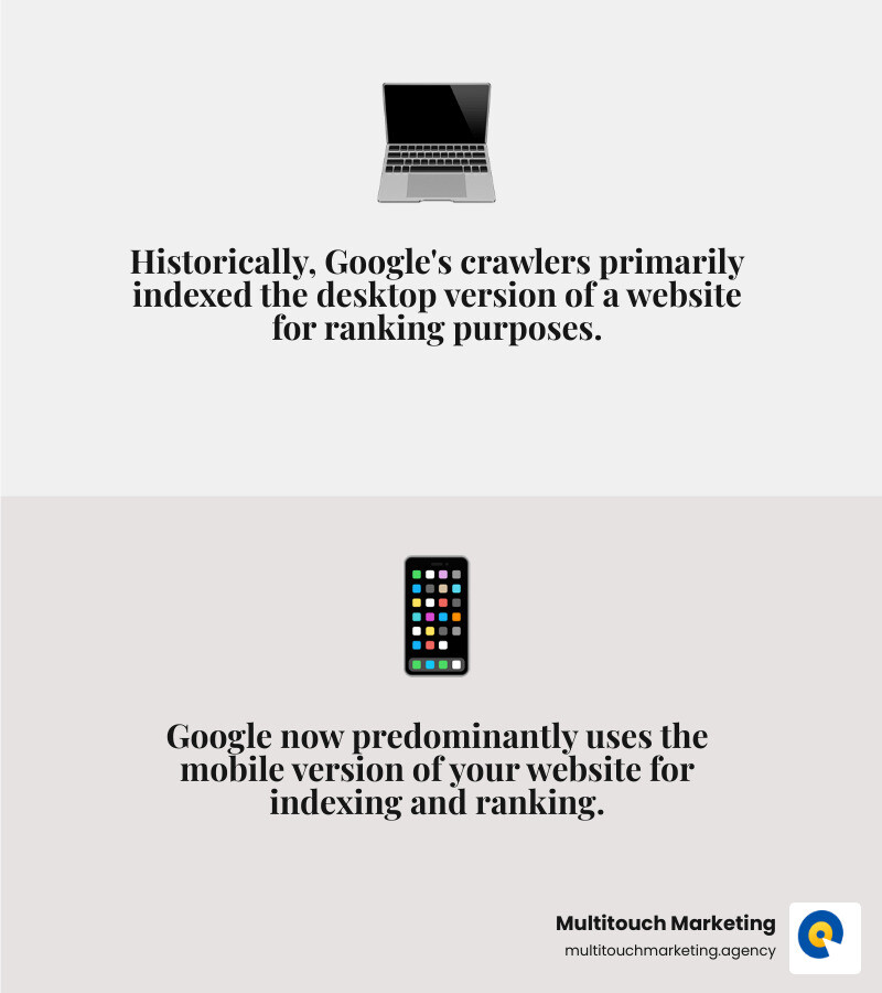
Mobile-first indexing means Google predominantly uses the mobile version of your site for indexing and ranking. When Google’s crawlers evaluate your site, they look at the mobile version first.
This is a major shift. Previously, the desktop version was primary. But with over half of all searches happening on smartphones, Google now prioritizes the experience most users have. In practice, this means your mobile site must have the same valuable content as your desktop site, a concept known as content parity. If your mobile site is a stripped-down version, your rankings could suffer.
For the full technical details, check out Google’s official guide to mobile-first indexing.
Why is a mobile friendly website design crucial for SEO?
A mobile friendly website design is essential for SEO success.
- Direct Ranking Impact: Google explicitly states that mobile-friendly sites rank higher. If your site isn’t optimized for mobile, you’re at a disadvantage.
- User Experience Signals: When mobile users get frustrated and leave your site quickly (high bounce rate), it signals to Google that your page isn’t a good result. Positive engagement, like longer dwell times, can boost your rankings.
- Core Web Vitals: These metrics (LCP, FID, CLS) measure user experience and are critical ranking factors. Optimizing your mobile site for speed and stability directly improves these scores.
- Local SEO Benefits: Many mobile searches have local intent (“plumber near me”). A mobile-optimized site with click-to-call buttons and embedded maps is crucial for capturing these ready-to-act customers.
We explore this connection further in our article on how Responsive Website Design Matters for SEO.
5 Examples of Exceptional Mobile Websites (And What We Can Learn)
Let’s look at real-world examples of great mobile friendly website design to see these principles in action. These sites are designed to deliver results, offering valuable lessons for any industry.
1. The E-commerce Experience
Mobile e-commerce lives or dies by its ease of use. Great sites like Crumbl Cookies use dazzling vertical visuals to draw you in.
- Key Learnings: Use clean product grids, a streamlined checkout process, and a sticky “Add to Cart” button that’s always visible. High-quality, expandable product images are a must for letting users inspect details.
2. The B2B Lead Generation Site
B2B mobile sites must convey value quickly and make contact easy. Current’s mobile site does this with a concise mission statement right at the top.
- Key Learnings: Feature a clear value proposition above the fold. Keep lead-capture forms short and simple. Make contact info prominent with click-to-call numbers. Use case study carousels to showcase social proof efficiently.
3. The Local Service Provider
For local businesses in areas like Raleigh NC, your mobile site is your digital storefront. Planned Parenthood’s site is a great example, with an appointment filter on the homepage.
- Key Learnings: Click-to-call buttons are non-negotiable. Use embedded, interactive maps that link to navigation apps. Display hours of operation clearly. Feature customer testimonials to build trust quickly.
4. The Media & Content Hub
Content-heavy sites must balance visuals with readability. The recipe blog Serious Eats uses a magazine-style layout that is both appealing and functional.
- Key Learnings: Prioritize high-contrast, legible text for an uncluttered reading experience. Avoid excessive ads or pop-ups. Consider infinite scroll to keep users engaged and use sticky social share buttons to boost reach.
5. The Restaurant & Hospitality Site
Restaurants and hotels thrive on visual appeal and quick access to info. Crumbl Cookies again excels with vertical video hero sections that create an immediate craving.
- Key Learnings: Use engaging, mobile-optimized visuals. A sticky “Order Now” or “Book a Table” button makes conversion effortless. Ensure your menu is easy to read and your location and hours are easy to find with one-tap directions.
Testing Your Site and Avoiding Common Pitfalls
You’ve built your mobile friendly website design, but assumptions are dangerous. What looks great on your phone might fail on another. Rigorous testing is not optional—it’s essential.
Common Mobile Design Mistakes to Avoid
I’ve seen many businesses stumble over these simple mistakes. Here’s what to watch for:
- Unplayable Content: Anything relying on Flash simply won’t work on mobile. Use modern HTML5 and CSS for all interactive elements.
- Intrusive Pop-ups: A pop-up that takes over the screen and is hard to close frustrates users and can earn a Google penalty. If you must use them, make them easy to dismiss.
- Tiny, Unreadable Fonts: Forcing users to pinch and zoom is a recipe for a quick exit. Body text should be at least 16px.
- Crowded Touch Targets: When buttons and links are too small or close together, users make mistakes. Aim for a minimum size of 48×48 pixels with ample spacing.
- Required Horizontal Scrolling: All content should fit within the screen’s width and flow vertically. Sideways scrolling is a cardinal sin of mobile design.
Tools and Techniques for Testing Mobile Responsiveness
A thorough and ongoing testing process is key.
- Browser-Based Tools: Start with tools like Google Chrome’s DevTools. Its “Device Mode” simulates different screen sizes and is great for catching issues early.
- Third-Party Platforms: Services like BrowserStack provide access to hundreds of real device and browser combinations, allowing you to test under various network conditions (e.g., 3G vs. 5G).
- Google’s Mobile-Friendly Test: This free tool analyzes your page and tells you if it meets Google’s standards, offering actionable feedback.
- Real Device Testing: Nothing beats testing on actual hardware. Simulators can’t perfectly replicate the feel of tapping with a thumb. Keep a variety of iPhones, Androids, and tablets on hand to catch quirks that simulators miss.
Testing is an ongoing commitment to keep your site performing at its best as new devices and browsers emerge.
Frequently Asked Questions about Mobile Web Design
We often hear these questions from businesses about mobile friendly website design. Let’s clear up some common points.
What’s the difference between mobile-first and responsive design?
They are related but distinct concepts.
- Mobile-first design is a philosophy. You start designing for the smallest screen (a smartphone), focusing on core content and functionality. You then scale up, adding features for larger screens. This forces prioritization.
- Responsive design is the technical implementation. It uses flexible grids and CSS media queries to make a site adapt to any screen size.
The best modern approach combines both: a mobile-first strategy implemented with responsive techniques to ensure a great experience on every device.
How does mobile design impact business goals like sales or leads?
A good mobile experience directly impacts your bottom line by removing friction. When users can easily browse, read, and check out, they are more likely to convert. Fast load times prevent cart abandonment, and clear CTAs guide users to the next step.
For lead generation, especially for local businesses in Raleigh NC or Durham NC, a simple mobile form or a click-to-call button can be the difference between gaining a customer and losing one. From a paid media perspective, a seamless mobile landing page is critical for converting ad clicks into business, maximizing your Return on Ad Spend.
What is the ideal loading speed for a mobile website?
The goal is under 3 seconds. Studies show nearly half of visitors will abandon a site that takes longer to load. Every second of delay can decrease conversions by 7%, costing you real money.
Google also uses speed as a ranking factor, so a fast site is essential for both SEO and PPC performance. Achieving this speed requires optimizing images, minifying code, and using browser caching.
Conclusion: Make Every Tap and Scroll Count
The key takeaway is simple: your website must work beautifully on mobile. This isn’t a trend; it’s a business necessity.
A mobile friendly website design is fast, intuitive, and built for the thumb. It acknowledges that Google uses your mobile site for ranking and that the vast majority of users will experience your brand on a small screen.
A slow, clunky mobile site sends customers directly to your competitors. A smooth, fast experience builds trust and guides them toward your goals, whether that’s a sale, a lead, or a phone call.
At Multitouch Marketing, we often see well-crafted PPC campaigns wasted because the landing page fails on mobile. It’s like paying for visitors only to lock the door. Your ad spend is lost when the mobile experience creates friction.
The future of mobile is now. Every tap and scroll is an opportunity to win or lose a customer. A well-designed mobile site doesn’t just support your digital strategy—it amplifies it, turning traffic into measurable results.
Don’t let a poor mobile experience be the weak link in your marketing. Make every interaction count.


