Why Responsive Web Design Matters for Your Business Success
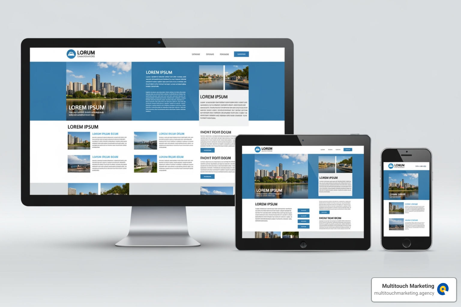
Responsive web design for your business is a fundamental requirement for online success. In simple terms, it ensures your website automatically adapts to any screen size, providing an optimal viewing experience on every device, from desktops to smartphones.
Key Benefits at a Glance:
- Better User Experience – No more pinching, zooming, or horizontal scrolling
- Higher Search Rankings – Google prioritizes mobile-friendly sites
- Increased Conversions – Visitors can easily complete actions on any device
- Cost Efficiency – One website works everywhere, no separate mobile site needed
- Future-Proof – Adapts to new devices and screen sizes
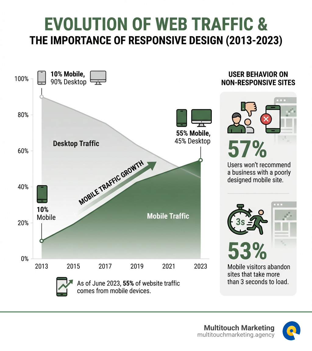
The numbers tell a compelling story. As of June 2023, 55% of website traffic comes from mobile devices. Furthermore, 57% of users won’t recommend a business with a poorly designed mobile site, and 53% of mobile visitors abandon sites that take more than 3 seconds to load.
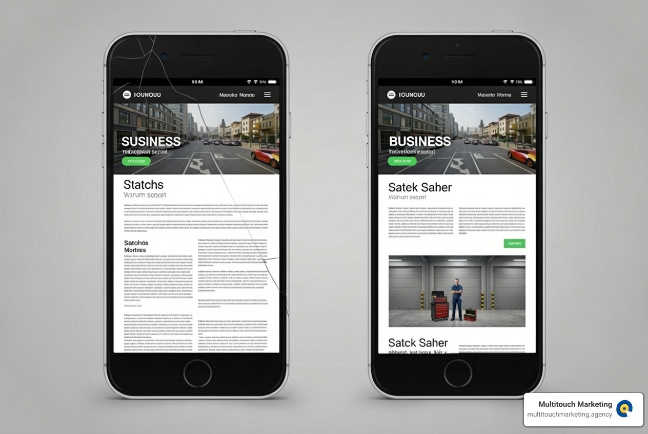
Think of the last time you struggled with a non-mobile-friendly site on your phone—zooming, squinting, and missing buttons. It’s a frustrating experience that sends potential customers straight to your competitors.
I’m Milton Brown. With over 15 years in digital marketing, managing campaigns from $20,000 to $5 million, I’ve seen how responsive design directly impacts revenue and user engagement. Businesses that prioritize it consistently outperform those that don’t, and the gap is widening.
Why Responsive Web Design for Your Business is a Game-Changer
A website that adapts to every screen isn’t a luxury—it’s a necessity. Responsive web design for your business is a game-changer, ensuring your online presence is optimal no matter how customers find you.
When your website offers a consistent, high-quality experience, it improves user interaction. Imagine a customer in Raleigh, NC, browsing your site on their phone. A clunky site will make them leave. A responsive design allows them to browse and buy effortlessly, turning curiosity into a conversion. This seamless experience boosts user engagement and mobile traffic. According to Statista, more than 54.8% of global web traffic comes from mobile devices, and ignoring this mobile majority means losing a huge part of your audience in North Carolina and beyond.
A responsive site projects professionalism and credibility, telling visitors you care about their experience. This builds trust and strengthens your brand. In contrast, a poor mobile site can damage your reputation, as over 57% of users won’t recommend a business with one.
For a deeper dive into how this approach can transform your online presence, explore our insights on Responsive Web Design.
Boost User Experience and Reduce Bounce Rates
Responsive design delivers an exceptional user experience (UX) on any device. No more frustrating pinching and zooming. Content, images, and navigation adapt automatically, whether a user is on a desktop in Durham, NC, or a tablet in Chapel Hill, NC. This effortless interaction keeps visitors engaged.
Responsive design also boosts performance and page load times. A 1-second delay can cut conversions by 7%. Critically, 53% of mobile site visits are abandoned if the page takes more than 3 seconds to load. A properly implemented responsive design with optimized images and code loads faster, reducing bounce rates and leading to longer, more meaningful site interactions.
Ensuring your website is always running smoothly involves more than just a great initial design. Learn more about how we help with our Website Maintenance services.
Strengthen Your Brand and Increase Conversions
Your website is often a potential customer’s first impression of your business. A responsive design projects a consistent and trustworthy brand image across every touchpoint. Studies show that over 48% of users believe website design is the top factor in determining a business’s credibility. A polished, functional site on any device signals reliability and quality—a huge win in competitive markets like Raleigh, NC.
This trust and seamless UX directly boost conversion rates. A responsive site removes friction, making it easy for visitors to fill out forms, browse products, and complete purchases on any device. This leads to more conversions and a healthier bottom line. Responsive design isn’t just about aesthetics; it’s about driving business growth and gaining a competitive edge.
The Technical Pillars of a Responsive Website
Behind every adapting website are a few fundamental technical principles. These building blocks allow a single site to intelligently rearrange its content for any device, from a large monitor to a smartphone. Understanding these pillars is key to appreciating the power of responsive web design for your business.
Coined by Ethan Marcotte in 2010, responsive design is built on three core components: fluid grids, flexible images, and media queries. These work together to ensure your layout and visuals are optimal on any device. Adopting a mobile-first approach—designing for small screens first and then enhancing for larger ones—is a key principle that ensures critical content is always accessible.
For those just starting to explore the foundational concepts, our Beginners Guide to Responsive Web Design Principles offers a great starting point.
Fluid Grids, Flexible Images, and Media Queries Explained
Let’s break down the technical backbone of responsive design:
-
Fluid Grids: Instead of fixed pixels, fluid grids use proportional units like percentages. This allows layout elements to scale automatically (e.g., from 50% width on a desktop to 100% on mobile), ensuring content always fits the screen.
-
Flexible Images: Flexible images use CSS (
max-width: 100%) to scale down gracefully without distorting or overflowing the screen. This prevents slow load times on mobile. Advanced techniques like using the -
Media Queries: These are CSS rules that apply different styles based on device characteristics like screen width. For example, a media query can change a navigation menu to a hamburger icon on smaller screens. These rules, or “breakpoints,” allow layouts to adapt precisely where the design needs to change.
Understanding where and how your website’s layout shifts is important. Our insights on Responsive Web Design Breakpoints can provide further clarity.
Key SEO benefits of responsive web design for your business
Beyond happy users, responsive web design for your business delivers significant SEO advantages. Google uses “mobile-first indexing,” meaning it primarily ranks your site based on its mobile version. Since mobile-friendliness is a key ranking factor, a poor mobile site will hurt your search rankings.
A single responsive site uses one URL for all devices. This avoids duplicate content issues and consolidates all your SEO authority—like backlinks and social shares—into one powerful domain.
Furthermore, responsive design improves crawl efficiency, as search bots only need to crawl one version of your site. This is especially beneficial for local businesses in Raleigh, Durham, and Chapel Hill, NC, as a mobile-friendly site ranks better in crucial “near me” searches.
A responsive website is a foundational element of any successful SEO strategy. To learn more about optimizing your online presence, check out our comprehensive guide on SEO Search Engine Optimization.
Best Practices for Implementing and Testing Your Responsive Design
Implementing responsive web design for your business is a strategic process requiring careful planning. To open up growth, best practices must be followed to ensure adaptability, performance, and accessibility.
A key principle we advocate is mobile-first design. This means designing for the smallest screens first, prioritizing essential content. From there, we progressively improve the design for larger screens. This ensures your core message is always delivered effectively.
Performance optimization is also non-negotiable. Slow sites frustrate users and hurt SEO. We optimize performance with image compression, lazy loading, and code minimization. Adhering to accessibility standards (WCAG) ensures your site is usable by everyone. Rigorous cross-device testing and careful content prioritization are also key to a great user experience.
For a comprehensive approach to keeping your website in top shape, explore our Website Maintenance Best Practices.
Design and Development Best Practices
To create an outstanding responsive website, we focus on several key areas:
- Optimize Images and Media: Compress images, use modern formats like WebP, and implement responsive image techniques (
srcset, - Focus on Thumb-Friendly Navigation: Mobile navigation should be easy to reach and tap. We use patterns like hamburger menus and place key elements within easy reach for thumbs.
- Prioritize Content for Small Screens: On smaller screens, we prioritize essential information and calls to action. Card-based designs that stack vertically are excellent for helping users get critical information quickly.
- Ensure Readability with Responsive Typography: Text must be legible on all screens. We use relative units (
em,rem) and media queries to adjust font sizes, ensuring text is always readable and zoomable. - Follow web content accessibility guidelines (WCAG): An accessible site is better for everyone. This includes ensuring sufficient color contrast, adding alt text to images for screen readers, and making all interactive elements keyboard-navigable.
- Build Responsiveness at a Component Level: We design individual components (like forms or buttons) to be responsive, ensuring consistency and flexibility across the site.
- Collaborate Between Design and Development: Effective responsive design requires tight collaboration between designers and developers to define how content and elements adapt at every breakpoint.
For more insights on keeping your website up-to-date, check out our 2022 Website Design Tips.
Measuring the success of responsive web design for your business
Once your responsive website is live, measuring its effectiveness is crucial. We rely on key metrics and tools to track performance:
- Key Metrics: We monitor Bounce Rate, Conversion Rate, and Page Load Speed across devices. A drop in mobile bounce rate after a redesign is a strong sign of success.
- Analytics Tools: Google Analytics provides invaluable data on user behavior, traffic, and conversions, helping us identify areas for improvement.
- Heatmaps and Session Recordings: Tools like Hotjar provide visual insights. Heatmaps show where users click and scroll, while session recordings let us watch user interactions to identify friction points.
- A/B Testing: We use A/B testing to get concrete data on which design choices lead to better outcomes, such as testing different mobile navigation styles.
- Before-and-After Analysis: Comparing data from before and after the redesign clearly shows its impact, such as a significant drop in mobile bounce rates.
Understanding the goals behind any website redesign is paramount. Read more about setting effective targets with our insights on Goals for a Website Redesign.
Common Challenges and How to Overcome Them
While the benefits of responsive web design for your business are immense, the journey can present challenges. With careful planning, these are surmountable:
- Complex Navigation: Large desktop menus don’t work on small screens. The solution is to use mobile-friendly patterns like hamburger menus and prioritize essential links.
- Slow Performance: Large images and excessive code can slow down responsive sites. The solution is to aggressively optimize media, minimize code, and use browser caching and a CDN.
- Inconsistent User Experience: Maintaining a consistent brand feel across all screen sizes can be challenging. The solution is to use a style guide and conduct thorough user testing on multiple devices.
- Testing Complexity: Testing across countless devices and browsers is a major challenge. The solution is to use testing tools like BrowserStack and Chrome DevTools to test on a representative set of common devices.
- Browser Compatibility: Older browsers may not support modern CSS features. The solution is to use progressive improvement to ensure a basic experience on older browsers while delivering a richer one on modern browsers.
The Future of Web Design is Responsive and Beyond
The digital landscape is always evolving. While responsive web design for your business remains foundational, it will be improved by emerging technologies and trends.
Artificial intelligence (AI) is already changing web design by streamlining workflows, automating testing, and offering design suggestions. This helps create more personalized websites, with AI potentially adjusting layouts in real-time based on user data.
We’re also seeing a rise in Voice User Interface (VUI). Websites will need to be optimized not just for visual display but also for how their content can be accessed through voice commands. This means structuring content semantically.
Adaptive design elements are gaining traction, moving beyond simply resizing to intelligently serving different content or layouts based on user preferences or behavior.
Microinteractions—small animations or visual feedback triggered by user actions—will continue to play a crucial role in enhancing user experience. Coupled with minimalist design trends, which focus on clean layouts and essential content, these elements create highly engaging yet uncluttered experiences.
The goal is to future-proof your website. This means embracing flexible design frameworks, prioritizing performance and accessibility, and staying informed about the latest advancements. A truly responsive, forward-thinking website will be ready to meet whatever comes next.
Frequently Asked Questions about Responsive Design
What is the difference between responsive and adaptive web design?
Responsive and adaptive design both aim to create a good multi-device experience, but they work differently.
- Responsive Web Design: Uses a single, fluid layout that continuously adjusts to any screen size, like water filling a container. It relies on fluid grids and media queries.
- Adaptive Web Design: Uses a set of pre-designed, fixed layouts for specific screen sizes. The site detects the device and serves the appropriate layout, like choosing an outfit for a specific occasion.
Here’s a quick comparison:
| Feature | Responsive Design | Adaptive Design |
|---|---|---|
| Approach | Fluid, single codebase | Fixed, multiple layouts/templates |
| Layout Change | Continuous adjustment | Switches at specific breakpoints |
| Flexibility | High, adapts to any screen size | Lower, limited to predefined layouts |
| Maintenance | Generally easier (one codebase) | Can be more complex (multiple versions) |
For most businesses in Raleigh, NC, and across North Carolina, responsive design offers the best balance of flexibility, scalability, and ease of maintenance.
How does responsive design impact website maintenance?
A key benefit of responsive web design for your business is simpler maintenance. Instead of managing separate desktop and mobile sites (like an “m.example.com”), which doubles the work for updates and fixes, you have one site to manage.
With a single responsive website, maintenance becomes significantly simplified:
- Lower Costs: Managing one site instead of two reduces development hours and long-term costs.
- Easier Updates: Content changes are made once and apply everywhere, saving time and ensuring consistency.
- Streamlined Troubleshooting: Bugs are diagnosed and fixed in one place.
- Consistent Branding: A single site ensures your brand and messaging are consistent across all devices.
To understand the full scope of what’s involved in keeping your site running smoothly, explore our Website Maintenance Services Includes.
Is a responsive website enough for good SEO?
A responsive website is crucial for SEO, but it’s not a magic bullet. It’s the foundation for a successful SEO strategy.
Here’s why it’s essential, and what else you need:
- Foundation for SEO: Google’s mobile-first indexing makes a responsive site essential. It’s a major ranking factor that impacts mobile performance, page speed, and local search visibility in areas like Chapel Hill, NC.
- Technical SEO: You still need a solid technical foundation, including clean code, schema markup, XML sitemaps, and HTTPS.
- On-Page SEO: Content must be optimized with keywords, clear headings, and meta descriptions to be findable.
- Quality Content: High-quality, relevant content that answers user questions is still the most important factor for SEO.
- Backlinks: Earning quality backlinks is critical for building authority and improving rankings.
So, while responsive web design for your business is a non-negotiable prerequisite for modern SEO, it’s one piece of a larger puzzle. To learn more about how a comprehensive SEO strategy can propel your business forward, dig into How SEO Pushes Business Growth.
Conclusion: Build a Future-Proof Foundation for Growth
Responsive web design for your business is an essential investment. It improves user experience, reduces bounce rates, boosts SEO, and increases conversions. A seamless, credible online presence strengthens your brand and drives growth.
The digital landscape will continue to evolve. A responsive website is inherently future-proof, designed to adapt to whatever comes next, saving your business time and money. It’s a strategic decision that positions your business for sustained growth in the markets of Raleigh, Durham, Chapel Hill, and across North Carolina.
At Multitouch Marketing Agency, we understand the critical role responsive design plays in your overall digital strategy. Our expertise in creating outstanding, custom responsive websites ensures your business meets and exceeds the expectations of today’s online audience.
Don’t let a non-responsive website hold your business back. Accept the power of adaptable design and watch your online presence flourish.
Contact us to learn more about our Responsive Web Design Services


