Why Your Website Needs to Be Responsive Now
Responsive website redesign is the process of rebuilding your site to automatically adapt to any screen size—desktop, tablet, or mobile—for a seamless user experience.
Have you ever had to pinch and zoom on your phone just to read a website? That’s what happens when a site isn’t responsive. Today, with over 60% of all web traffic coming from mobile devices, a non-responsive site means you’re losing customers.
The stakes are high. 94% of people judge a website’s credibility based on its design. A clunky site tells visitors your business is outdated. But responsive design isn’t just about looks; it directly impacts your bottom line. Over 72% of marketers report increased conversions after making their sites responsive.
Google also prioritizes responsive sites. Since 2019, the search engine has used mobile-first indexing, meaning your mobile site’s performance determines your search rankings. A non-responsive site doesn’t just frustrate users—it tanks your SEO.
A strategic responsive website redesign can update your existing site to work flawlessly on every screen, boosting user experience, search visibility, and revenue.
I’m Milton Brown, a digital marketing manager since 2008. I’ve seen how a responsive redesign transforms businesses by improving conversion rates and streamlining user journeys across all devices. Let’s explore how to get your site ready for every visitor.
Foundations of Responsive Design
In 2010, web designer Ethan Marcotte published a groundbreaking article, “Responsive Web Design“. He proposed that websites should adapt to any screen using three core concepts: fluid grids, flexible images, and media queries. This idea changed web design forever.
Today, a responsive website redesign is essential. Mobile users are more likely to stay engaged on responsive sites because they are easier to use—no pinching or zooming required. Beyond user satisfaction, Google’s mobile-first indexing means your mobile site’s quality determines your search rankings. A responsive design creates one site that works everywhere, making it easier for Google to crawl and index your content while saving you the time and money of maintaining separate desktop and mobile versions. For more on the basics, see our Beginners Guide to Responsive Web Design Principles.
What is Responsive Web Design and Why is it Important?
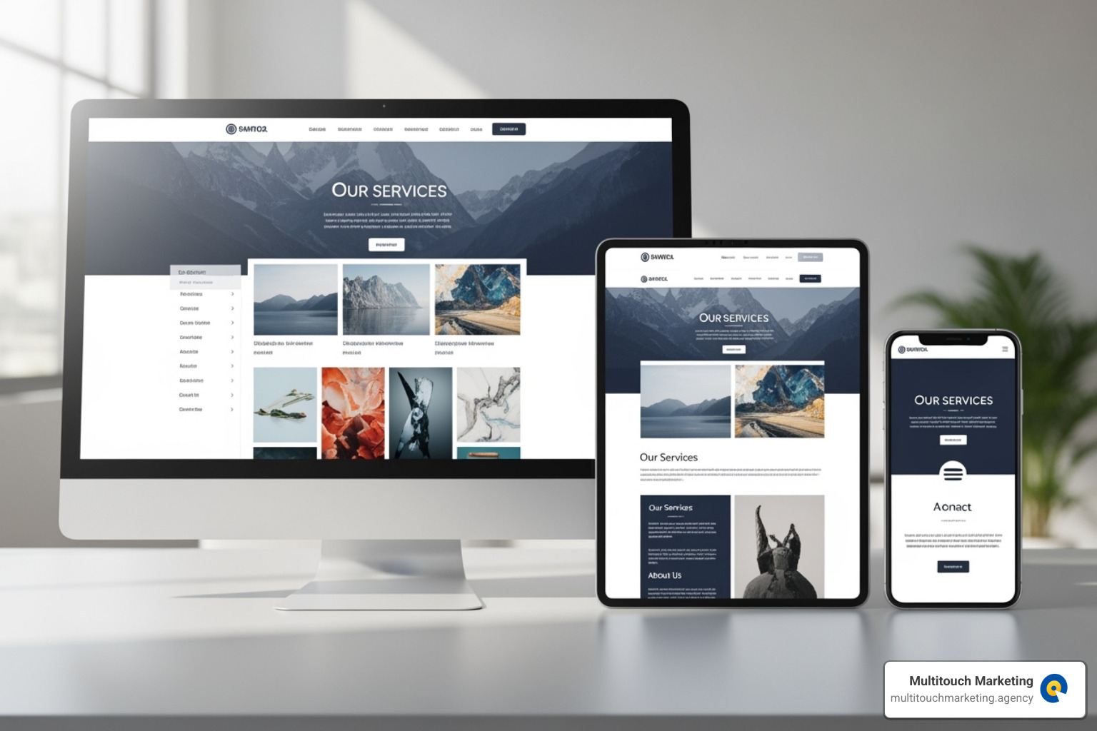
Responsive web design ensures your website’s layout, images, and content automatically adjust to look great on any device, from a large desktop monitor to a small smartphone. It uses fluid grids (built with percentages), flexible images that resize without distortion, and media queries that rearrange content based on screen size.
This matters because a poor mobile experience can turn away more than half your potential audience. A responsive design creates a smoother user journey, which means visitors stay longer and bounce less. Google rewards this positive engagement with better search rankings. Since 75% of users judge a business’s credibility by its website design, a modern, responsive site is crucial for building trust and encouraging conversions.
The Business Case for a Responsive Website Redesign
A responsive website redesign is an investment that delivers a strong return. By making it easier for people to use your site on any device, you can significantly increase conversions. A responsive design also contributes to faster load times, which keeps visitors engaged instead of leaving in frustration.
Maintenance costs also drop. Updating one responsive site is far more efficient than managing separate desktop and mobile versions. Your brand perception improves instantly when your site just works, making you look professional and trustworthy. Finally, a responsive site is future-proof, ready to adapt to new devices and screen sizes as they emerge. To learn how this affects search visibility, read our guide on Responsive Web Design and Search Engine Optimization.
The Core Components of a Responsive Website Redesign
A successful responsive website redesign reimagines how users interact with your content on different devices. Most modern redesigns use a mobile-first approach, designing for small screens first and then scaling up. This forces a focus on essential content. A crucial technical detail is the viewport meta tag, which tells mobile browsers how to control the page’s dimensions and scaling. For a deeper look at these building blocks, see our guide on Responsive Web Design Techniques.
Flexible Layouts and Grids
The foundation of a responsive website redesign is a flexible layout. Fluid grids use percentages instead of fixed pixels, allowing elements to scale proportionally. Modern design also uses relative units like em, rem, vw, and vh for scalable fonts and spacing.
For arranging content, CSS Flexbox is excellent for one-dimensional layouts like navigation menus or card groups. For more complex, two-dimensional layouts with rows and columns, CSS Grid provides precise control. An excellent resource for mastering Flexbox is A guide to flexbox. Together, these tools ensure your site’s structure remains readable on any device.
Media Queries for Adaptability
Media queries are CSS rules that apply styles based on device characteristics. They act as “if-then” statements for your design. The most common use is creating breakpoints based on screen width, allowing you to define different layouts for phones, tablets, and desktops. Media queries can also detect device orientation (portrait vs. landscape) and high-resolution displays to serve sharper images. Our Responsive Web Design Breakpoints guide offers more detail on choosing the right breakpoints.
A basic media query looks like this:
@media screen and (max-width: 768px) {
  .column {
    width: 100%;
  }
}
This code tells the browser to make columns full-width on screens 768px or narrower, stacking them vertically for mobile readability.
Responsive Images, Videos, and Text
Unresponsive media can ruin a layout. The simplest fix is setting max-width: 100% in your CSS, which ensures images and videos scale down gracefully. For better performance, the srcset attribute lets the browser choose the best image resolution for the user’s screen, preventing mobile users from downloading unnecessarily large files.
The <picture> element allows for “art direction,” where you can serve different image crops for different screen sizes—for example, a wide landscape photo on desktop and a tight portrait crop on mobile.
Responsive text is vital for readability. The CSS clamp() function is a modern tool that allows font size to scale fluidly with the viewport while staying within a set minimum and maximum size, ensuring text is always legible.
Designing Responsive Navigation
Navigation is a common challenge in a responsive website redesign. A wide desktop menu becomes unusable on a small phone screen. Common solutions include:
- Hamburger menu: The standard three-line icon that reveals a menu when tapped.
- Priority+ navigation: Keeps essential links visible and tucks secondary ones into a “More” menu.
- Off-canvas menus: Slide in from the side of the screen, offering a full-screen navigation experience.
Regardless of the pattern, ensure all interactive elements are large enough for easy tapping with a thumb. Place key actions in the natural “thumb zone” and ensure your navigation is accessible to screen readers and keyboard users.
Boosting Performance and Conversions
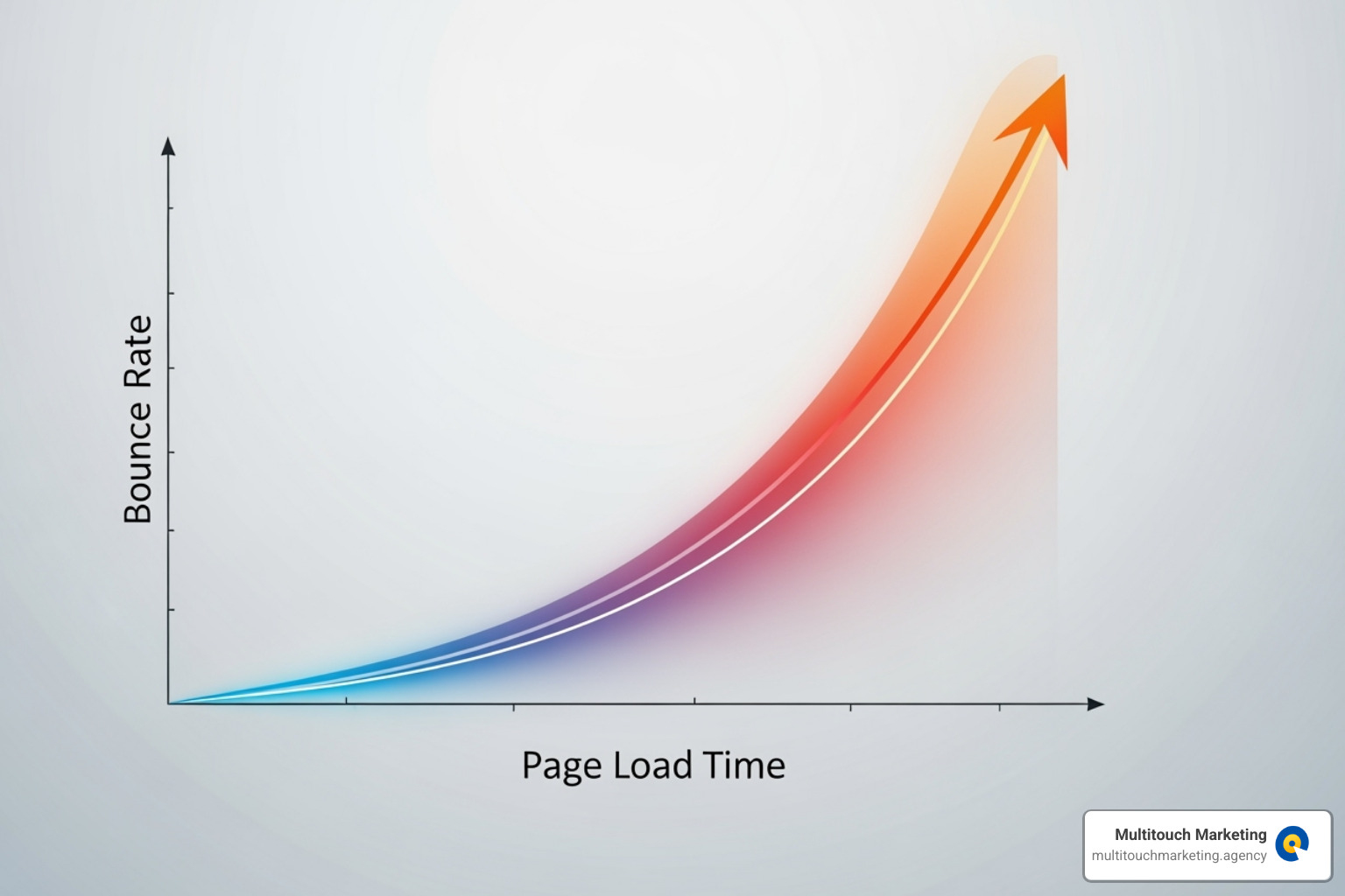
A beautiful responsive website redesign is useless if it’s slow. Performance isn’t just about user satisfaction; it’s about business results. Fast sites rank higher, convert more visitors, and build trust. Google’s Core Web Vitals—Largest Contentful Paint (LCP), Interaction to Next Paint (INP), and Cumulative Layout Shift (CLS)—are metrics that judge your site’s quality and directly impact your bottom line. With 53% of users abandoning a site that takes longer than 3 seconds to load, speed is critical.
How Responsive Design Impacts SEO
A responsive website redesign is a powerful SEO tool. Google uses mobile-first indexing, meaning it primarily evaluates your mobile site to determine search rankings. A poor mobile experience will hurt your visibility, regardless of how great your desktop site is.
Responsive design provides a single URL for all devices, which eliminates duplicate content issues and consolidates your link equity. This makes it easier for search engines to crawl and index your site efficiently.
Furthermore, responsive design improves user behavior signals that Google monitors. When a site works well on any device, users stay longer and bounce less. These positive signals tell Google your content is valuable, which can boost your rankings. A seamless experience keeps users engaged and moving toward conversion. For a deeper dive, explore our article on why Responsive Website Design Matters for SEO.
Optimizing for Speed and Performance
Speed optimization is a crucial part of your responsive website redesign. Key techniques include:
- Image Optimization: Compress images, use modern formats like WebP, and implement lazy loading so off-screen images don’t slow down the initial load.
- Caching: Store frequently accessed files on users’ devices or nearby servers (CDNs) to dramatically reduce load times for return visits.
- Minimizing Code: Strip unnecessary characters and whitespace from CSS and JavaScript files to make them smaller and faster to download.
- Using a Content Delivery Network (CDN): Distribute your site’s assets across a global network of servers, so content is delivered quickly to users anywhere in the world.
- Optimizing the Critical Rendering Path: Prioritize loading the content that appears “above the fold” first, creating the perception of speed while the rest of the page loads in the background.
These efforts improve your Core Web Vitals scores, which directly influence search rankings. We use tools like GTmetrix, Google PageSpeed Insights, and WebPageTest to measure performance and identify specific areas for improvement.
Tools, Testing, and Launching Your Redesigned Site
The right tools can make a responsive website redesign much more manageable. From design to development and testing, modern software streamlines the entire process.
Popular Frameworks and Design Tools
You don’t have to build from scratch. CSS frameworks like Bootstrap, W3.CSS, and Foundation provide pre-built responsive grids and components that accelerate development.
On the design side, Figma is the industry standard. Its Auto Layout feature helps create flexible designs that adapt as content changes. You can create frames for different breakpoints and use reusable components for consistency. Figma’s prototyping and “Dev Mode” features also streamline the handoff from design to development by generating code snippets and specifications, ensuring a smoother workflow.
Best Practices for Testing a Responsive Website Redesign
Thorough testing is essential before launching your responsive website redesign. What looks perfect on one device may break on another.
- Browser Developer Tools: Use the built-in tools in Chrome, Firefox, and Safari to quickly simulate different device viewports and network conditions.
- Real Device Testing: This is non-negotiable. Test on physical iPhones, Android phones, and tablets to check for hardware-specific quirks and touch interactions.
- Cross-Browser Compatibility: Ensure your site renders correctly on all major browsers, including Chrome, Firefox, Safari, and Edge.
- Breakpoint Testing: Resize your browser window to check how the layout transforms at each breakpoint. Look for awkward gaps or overlapping elements.
- User Acceptance Testing (UAT): Invite real users to provide feedback. They often spot usability issues that your team might miss.
- Validation Tools: Use Google’s Mobile-Friendly Test to confirm your site meets Google’s criteria. For performance, tools like GTmetrix and Google PageSpeed Insights provide actionable recommendations to improve speed.
Frequently Asked Questions about Responsive Redesigns
When considering a responsive website redesign, many businesses have similar questions. Here are answers to the most common concerns.
What are the first steps in a responsive website redesign?
The process begins with auditing your current site’s performance and analytics to understand user behavior and device usage. The next step is to define clear, measurable goals, such as improving mobile conversion rates by a specific percentage. Finally, research your audience to ensure the new design serves their actual needs.
How long does a responsive redesign take?
The timeline varies based on project complexity. A small, simple site might take a few weeks, while a large e-commerce platform with custom features could take several months. Factors like content volume, custom integrations, and team availability all influence the schedule.
Is a mobile-first approach always better?
For most projects, a mobile-first approach is a highly recommended best practice. It forces you to prioritize essential content and functionality for the smallest screens, which leads to a cleaner, more focused experience on all devices. While there can be exceptions for desktop-dominant industries, starting with mobile is essential for the vast majority of businesses today.
Conclusion: Your Next Steps to a Future-Proof Website
A responsive website redesign is no longer optional; it’s the foundation of a modern online presence. Your site must adapt seamlessly to any screen, from phones and tablets to desktops.
By implementing fluid grids, smart media queries, and optimized media, you’re not just fixing technical issues. You’re creating a better user experience that leads to higher engagement, more conversions, and improved search rankings. Google’s mobile-first indexing rewards sites that offer a great mobile experience, making responsiveness a critical SEO factor.
This is about putting your users first. A site that works effortlessly on any device builds trust and shows you respect your customers’ time. It’s often the first conversation you have with a potential customer, so make it a good one.
At Multitouch Marketing, we specialize in changing websites into high-performing, responsive assets that drive real results. We bring technical expertise and strategic thinking to ensure your redesign meets your unique business goals.
Ready to future-proof your site? Take the next step with our expert responsive web design services and let’s build something that works beautifully on every screen.


