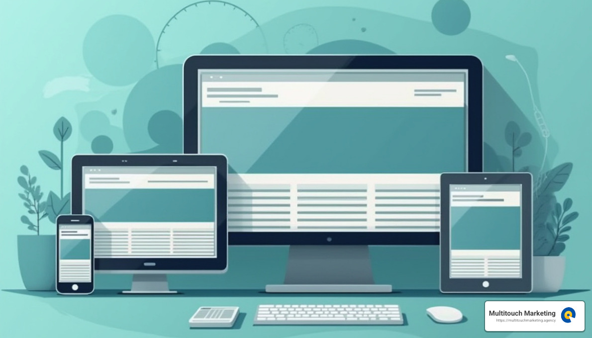
Responsive web design techniques are redefining how businesses create and manage their online presence in a multi-device world. As more users access websites from various devices, from smartphones to desktops, businesses must ensure their sites provide a seamless and accessible experience everywhere. Core techniques include:
- Flexible layouts: Adapts to various screen sizes ensuring content remains accessible.
- Fluid images: Automatically resize to fit their container, preventing layout breaks.
- Media queries: Apply different styles based on device characteristics like width or orientation.
Responsive web design is not just a trend; it’s essential for usability and a better user experience.
As someone who has spent years in the digital marketing space, I have witnessed how effective responsive web design techniques not only improve usability but also drive brand engagement and conversions. My expertise as a strategic digital marketer with a focus on responsive techniques informs how I guide businesses to optimize their online presence for all devices, ensuring a smoother user experience and improved ROI.

Understanding Responsive Web Design
Responsive web design began gaining traction in 2010, thanks to Ethan Marcotte, who coined the term and laid the groundwork for this essential approach. Marcotte’s vision was simple yet revolutionary: websites should adapt to the user’s device, ensuring a seamless experience whether viewed on a phone, tablet, or desktop.
Fluid Grids
A key concept introduced by Marcotte is fluid grids. Unlike fixed layouts that use specific pixel values, fluid grids use relative units like percentages. This allows the layout to adjust dynamically to different screen sizes. Imagine a website that looks just as good on a tiny phone screen as it does on a large monitor. Fluid grids make this possible by ensuring each element scales proportionally.
Media Queries
Media queries are another cornerstone of responsive web design. They allow developers to apply different styles depending on device characteristics such as screen width or resolution. For example, you might have a single-column layout for mobile devices and switch to a multi-column layout for larger screens. This adaptability ensures that content is always presented in the most user-friendly way.
@media screen and (min-width: 80rem) {
  .container {
    margin: 1em 2em;
  }
}
The above code snippet demonstrates how media queries can be used to adjust styles based on the screen size. By setting breakpoints, you can create a design that feels tailor-made for every user, regardless of their device.
Flexible Media
Flexible media ensures that images and videos resize within their containers, preventing overflow and maintaining the integrity of the design. By setting the max-width property of images to 100%, they become responsive, scaling down when needed but never exceeding their original size. This avoids pixelation and maintains visual quality across devices.

Incorporating these responsive web design techniques is crucial for creating websites that provide an optimal user experience. As Marcotte envisioned, the web should be as flexible as the devices accessing it, adapting effortlessly to provide a consistent and engaging experience for every user.
Responsive Web Design Techniques
When it comes to crafting a website that looks and functions well on any device, responsive web design techniques are your best friend. Let’s break down some key components that will help you achieve this flexibility.
HTML and CSS
At the heart of responsive web design are two fundamental technologies: HTML and CSS. HTML provides the structure of your web pages, while CSS is used to style and lay them out. Together, they allow you to create a website that can seamlessly adjust to different screen sizes.
Resize, Hide, Shrink, Enlarge
Responsive design is all about adaptability. You can use CSS to resize, hide, shrink, or enlarge elements based on the user’s device. For example, you might hide a sidebar on a mobile view or enlarge text for better readability on a tablet.
Fluid Grids
Fluid grids are a game-changer in responsive design. By using percentage-based widths instead of fixed pixel values, fluid grids ensure that your layout adapts to the screen size. This means that whether your user is on a smartphone or a desktop, your site will look great.
Media Queries
Media queries are a powerful tool that allows you to apply different CSS styles depending on the device’s characteristics, like screen width or orientation. This means you can create a single-column layout for mobile devices and switch to a multi-column layout for larger screens.
Here’s a simple example of a media query:
@media screen and (min-width: 80rem) {
  .container {
    margin: 1em 2em;
  }
}
This snippet adjusts the margins of a container if the screen width is at least 80rem, ensuring a design that adapts to larger screens.
Flexible Media
To keep your images and videos looking sharp, use flexible media techniques. By setting an image’s max-width to 100%, it will resize within its container, maintaining its quality without overflowing.
Incorporating these techniques ensures that your website is not only visually appealing but also user-friendly across all devices. This adaptability is what makes responsive web design so effective, meeting the needs of users no matter how they access your site.
Next, we’ll dive into the key elements that make a responsive design truly stand out.
Key Elements of Responsive Design
Creating a website that looks great on any device involves understanding a few essential components. Let’s explore these key elements of responsive design.
Viewport
The viewport is the user’s visible area of a web page. It varies with the device, so setting it correctly is crucial. Use the meta viewport tag in your HTML to control the page’s dimensions and scaling. Here’s a simple example:
<meta name="viewport" content="width=device-width, initial-scale=1">
This tag ensures your site adapts to the screen size, making it user-friendly on both phones and desktops.
Flexible Grid Layout
A flexible grid layout uses relative units like percentages instead of fixed units like pixels. This approach allows the layout to adjust smoothly to different screen sizes. For instance, using Flexbox or CSS Grid can automatically rearrange elements to fit the available space.
Fluid Images
Images can make or break your design. Fluid images automatically resize to fit their containers, preventing overflow and ensuring they look good on any screen. Use this CSS rule to keep images responsive:
img {
  max-width: 100%;
  height: auto;
}
This ensures images maintain their aspect ratio and quality across devices.
Media Queries
Media queries are CSS rules that apply styles based on the user’s device characteristics, like screen width. They allow you to create responsive breakpoints, so your website can shift layouts seamlessly. Here’s a quick snippet:
@media (min-width: 600px) {
  .menu {
    display: flex;
  }
}
This code makes a menu flexible on screens wider than 600 pixels, enhancing navigation.
Breakpoints
Breakpoints are the specific points where your design changes to accommodate different screen sizes. They are crucial for ensuring your content remains accessible and visually appealing. Instead of designing for every device, use breakpoints to adjust layouts at strategic points.

These key elements are the foundation of a responsive design, ensuring that your website is adaptable and user-friendly across all devices. Next, we’ll dig into the technologies that power these elements, like Flexbox and CSS Grid.
Responsive Layout Technologies
When it comes to building a responsive website, choosing the right layout technology is essential. Let’s explore some popular responsive web design techniques: Flexbox, CSS Grid, and Multicol. These tools help create flexible grids that adapt to various screen sizes.
Flexbox
Flexbox is a powerful CSS layout model designed for distributing space along a single row or column. It excels at aligning items and distributing space within a container, even when their size is unknown. Here’s a simple example of how Flexbox can be used:
.container {
  display: flex;
  justify-content: space-between;
}
With Flexbox, you can easily create flexible layouts that adjust based on the available space, making it perfect for responsive design.
CSS Grid
CSS Grid is another robust layout system that allows you to create complex designs with ease. Unlike Flexbox, which works in one dimension (either row or column), CSS Grid works in two dimensions (rows and columns). This makes it ideal for creating more intricate layouts. Here’s a basic setup:
.grid-container {
  display: grid;
  grid-template-columns: repeat(3, 1fr);
  gap: 10px;
}
CSS Grid provides the flexibility needed to design responsive layouts that look great on any device, allowing you to specify how elements should resize and rearrange.
Multicol
The Multicol layout is a lesser-known but useful technique for creating responsive columns. It enables you to flow content into multiple columns automatically. This is especially handy for text-heavy pages. Here’s a quick example:
.text-container {
  column-count: 3;
  column-gap: 20px;
}
Multicol can be a simple solution for creating responsive columns without the need for complex CSS rules.
Flexible Grids
A flexible grid is the backbone of any responsive design. It uses relative units like percentages rather than fixed pixels, allowing the layout to adjust smoothly across different screen sizes. By combining these technologies, you can create a grid that adapts to any device, ensuring a seamless user experience.
Incorporating these technologies into your web design toolkit will help you create responsive layouts that are both functional and visually appealing. Next, we’ll discuss how typography plays a role in ensuring your website remains readable and engaging on all devices.
Responsive Typography
Typography is more than just choosing a font. In responsive web design, it’s about ensuring text is readable and visually appealing on any device. Let’s explore how responsive web design techniques like media queries and viewport units can help achieve this.
Media Queries
Media queries are a cornerstone of responsive typography. They allow you to change font sizes based on the device’s characteristics, such as screen width. For example, you might want a large heading on a desktop but a smaller one on a mobile device. Here’s how you can use media queries to adjust font sizes:
h1 {
  font-size: 2rem;
}

@media (min-width: 1200px) {
  h1 {
    font-size: 4rem;
  }
}
With media queries, you can customize text size to improve readability across different devices, ensuring users have a seamless reading experience.
Viewport Units
Viewport units like vw (viewport width) and vh (viewport height) offer another way to make typography responsive. They adjust text size relative to the size of the viewport. This means text can scale with the screen size, maintaining readability. Here’s a simple usage:
h1 {
  font-size: 6vw;
}
However, it’s important to note that using viewport units alone can make text unzoomable, which might hinder accessibility. A better approach is combining them with fixed units using calc():
h1 {
  font-size: calc(1em + 2vw);
}
This method ensures text remains zoomable, enhancing user experience.
Font Sizes and Readability
Choosing the right font size is crucial for readability. A too-small font might be hard to read on a mobile device, while a too-large font can break the layout. Using responsive web design techniques, you can strike a balance that works for all screens. Consider the following tips:
- Use
remunits for font sizes, as they scale with the user’s base font size setting, improving accessibility. - Ensure line height and letter spacing are adjusted for different screen sizes to maintain readability.
Responsive typography is about making sure your text looks good and is easy to read, whether on a tiny phone screen or a large desktop monitor. By using media queries and viewport units wisely, you can improve the user experience and keep your audience engaged.
Next, let’s move on to frequently asked questions about responsive web design techniques and tackle some common queries.
Frequently Asked Questions about Responsive Web Design Techniques
What are responsive web design techniques?
Responsive web design techniques are methods used to create websites that adapt to different screen sizes and devices. The goal is to ensure usability and satisfaction for all users, whether they’re on a smartphone, tablet, or desktop.
Some key techniques include:
- HTML and CSS: These are the building blocks for responsive design. HTML structures the content, while CSS styles it to be flexible and adaptable.
- Flexible Media: Images and videos should resize according to the screen size. Using CSS properties like
max-width: 100%ensures media elements don’t overflow their containers. - Fluid Grids: Instead of fixed-width layouts, fluid grids use relative units like percentages to allow content to resize with the screen.
By using these techniques, websites can provide a seamless experience across all devices, improving user satisfaction.
Which technique is commonly used in responsive design?
Media queries are one of the most commonly used techniques in responsive design. They allow developers to apply different styles based on the device’s characteristics, such as screen width, height, or orientation.
Here’s a simple example of a media query:
@media (max-width: 768px) {
  .navigation-menu {
    display: none;
  }
}
In this example, the navigation menu is hidden on screens smaller than 768 pixels wide, which is typical for mobile devices. This adaptability makes media queries essential for creating responsive designs.
What are examples of responsive web design?
One well-known example of responsive web design is Spotify. The platform uses an intuitive interface that adjusts seamlessly across devices, offering users a consistent experience whether they’re using a phone, tablet, or desktop.
Spotify’s navigation menu transforms based on the screen size. On a desktop, it might appear as a sidebar with multiple options visible. However, on a mobile device, it becomes a dropdown menu, conserving space and maintaining usability.
Other examples of responsive design include websites that automatically adjust their layout and content to fit the user’s device, ensuring that every visitor has a positive experience, regardless of how they access the site.
These examples highlight how responsive web design techniques can transform web pages into user-friendly, adaptable platforms that meet the needs of a diverse audience.
Need help?
Responsive web design is not just a trend; it’s a necessity in today’s digital world. With the increasing variety of devices used to access the internet, having a website that adapts seamlessly to different screen sizes is crucial. Responsive design benefits include improved user experience, higher engagement, and better SEO rankings. When users find your site easy to steer, they’re more likely to stay longer and convert, which can lead to increased sales and customer satisfaction.
At Multitouch Marketing, we understand the importance of responsive web design and its impact on digital marketing. Our expertise in creating adaptable and user-friendly websites helps businesses reach a broader audience and stay competitive in a constantly evolving digital landscape.
Our team specializes in digital marketing strategies, including pay-per-click (PPC) advertising, ensuring that your business not only attracts visitors but also converts them into loyal customers. By integrating responsive web design techniques with our marketing strategies, we help you maximize your online presence and achieve your business goals.
In the world of digital marketing, staying ahead of the curve is essential. Let us help you create a responsive website that not only looks great but also delivers results. Reach out to us today and see how we can transform your web presence.