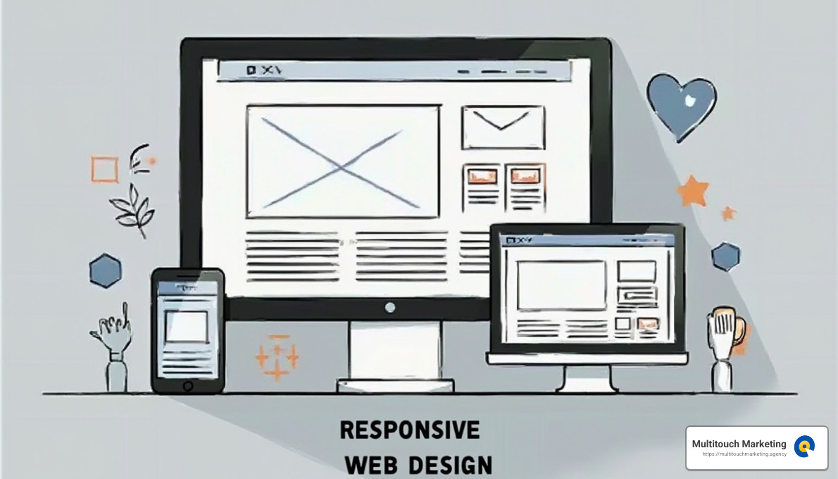
Responsive web design breakpoints are the secret ingredients that make sure your website looks great and functions well on any device. They allow your site’s layout to adjust automatically for different screen sizes, like mobile phones, tablets, and desktops. Here’s the quick answer you might be looking for:
- Breakpoints are predefined screen widths where your website’s design changes to improve readability and user experience.
- They’re implemented using CSS media queries, allowing your layout to adapt to various devices.
- Standard breakpoints often include widths like 320px for mobile, 768px for tablets, and 1024px for desktops, but these can vary based on your audience’s devices.
Responsive design improves user experience by ensuring that the content is easy to read and steer, no matter what device the user is using. This is crucial because nearly half of all web traffic comes from mobile devices. When your site is responsive, users don’t have to pinch and zoom or struggle with awkward navigation elements. Instead, your website seamlessly resizes and restructures, offering a comfortable browsing experience.
As Milton Brown, a digital marketing strategist with experience in responsive web design breakpoints, I’ve helped numerous organizations create flexible and user-friendly websites. My background includes working with diverse industries to ensure that all aspects of digital presence are optimized for user engagement across devices.

Understanding Responsive Web Design Breakpoints
Responsive web design breakpoints are like the checkpoints on a road trip. They guide your website’s layout to adjust smoothly, ensuring a pleasant user experience across different screen sizes. From tiny smartphone screens to expansive desktop monitors, breakpoints help your site look and work its best.
What Are Breakpoints?
Breakpoints are specific screen widths where your website’s design changes. These changes are crucial for maintaining readability and usability. Without them, your site might look great on a desktop but become a jumbled mess on a smartphone.
Think of breakpoints as the moments when your site “pauses” to adjust its layout. This might mean changing the number of columns, resizing images, or hiding certain elements to fit smaller screens.
How Do Media Queries Work?
Media queries in CSS are the tools that make breakpoints possible. They allow you to apply different styles based on conditions like screen width. Here’s a simple example:
/* Mobile devices */
@media only screen and (max-width: 576px) {
  .container {
    width: 100%;
  }
}

/* Tablets */
@media only screen and (min-width: 577px) and (max-width: 768px) {
  .container {
    width: 80%;
  }
}

/* Desktops */
@media only screen and (min-width: 769px) {
  .container {
    width: 60%;
  }
}
In this example, the .container class adjusts its width based on the device’s screen size, ensuring optimal content display.
Why Are Breakpoints Important?
Breakpoints are vital because they ensure your website is accessible and user-friendly on all devices. With nearly half of web traffic coming from mobile devices, ignoring breakpoints can lead to a poor user experience and lost visitors.
A well-designed site means users don’t have to pinch, zoom, or scroll sideways. Instead, they enjoy a seamless experience.
Essential Breakpoints for Different Devices
When designing a responsive website, understanding the essential breakpoints for different devices is crucial. Breakpoints ensure your site looks good and functions well, no matter the screen size. Let’s break it down by device type.
Mobile Devices
Mobile devices are everywhere, and their screens are often the smallest. For extra small mobile screens (320px – 480px), a single-column layout is ideal. This ensures content is easy to read and steer. For small mobile screens (481px – 600px), you might consider a two-column layout in landscape mode, allowing more content to fit side by side.

Tablets
Tablets sit between smartphones and laptops in terms of screen size. For small tablets (601px – 768px), a two-column layout is typical. This allows for a more magazine-like feel, with navigation becoming more accessible. For large tablets (769px – 1024px), a three-column layout might be introduced, maximizing space and enhancing user interaction.
Desktops
Desktops offer more real estate for content. Small desktops and laptops (1025px – 1280px) often use a multi-column layout, with navigation fully expanded. This setup takes advantage of the wider screens to display more content without overwhelming the user.
Extra-Large Screens
For extra-large desktops (1441px and up), you can get creative. These screens allow for complex layouts with multiple columns and interactive elements. This is where you can use sidebars, large navigation panels, and other advanced features to improve the user experience.
Why These Breakpoints?
These breakpoints are based on common screen sizes and user habits. By tailoring your design to these points, you ensure a seamless browsing experience across all devices.
In the next section, we’ll dive into implementing these breakpoints with CSS, using media queries and fluid grids to create a truly responsive design.
Implementing Breakpoints in CSS
Creating a responsive web design requires understanding how to implement breakpoints in CSS. This involves using media queries, mastering CSS syntax, and employing fluid grids for flexibility.
Media Queries: The Backbone of Responsive Design
Media queries are like the secret sauce in responsive web design. They allow your website to detect the user’s screen size and apply specific styles accordingly. Here’s a simple example:
@media screen and (min-width: 768px) {
  /* Styles for screens wider than 768px */
}
This snippet tells the browser to apply certain styles when the screen is at least 768 pixels wide. By using media queries, you can adjust layouts, font sizes, and more, ensuring a consistent look across devices.
CSS Syntax: Keeping It Simple
CSS syntax is the language you use to style your website. When working with breakpoints, organize your CSS rules efficiently. Here’s a basic structure:
/* Base styles for all devices */
body {
  font-size: 16px;
}

/* Styles for larger screens */
@media screen and (min-width: 1024px) {
  body {
    font-size: 18px;
  }
}
By defining base styles and then adding media queries, you can create a clean and maintainable stylesheet. This approach helps avoid clutter and ensures that your site remains easy to update.
Fluid Grids: Adapting to Any Screen
Fluid grids are a powerful tool for responsive design. Unlike fixed grids, which use set pixel values, fluid grids use percentages. This allows elements to resize based on the screen size.
Here’s a quick example:
.container {
  display: grid;
  grid-template-columns: repeat(auto-fit, minmax(250px, 1fr));
  grid-gap: 20px;
}
In this setup, the grid automatically adjusts the number of columns to fit the screen. The minmax function ensures that columns never shrink below 250 pixels, maintaining readability.
Fluid grids, combined with media queries, make your design flexible and adaptable. They ensure that your content looks great whether viewed on a mobile phone or a large desktop monitor.

Bringing It All Together
By using media queries, mastering CSS syntax, and implementing fluid grids, you create a responsive design that flows smoothly across devices. These techniques ensure your website is not only visually appealing but also functional and user-friendly.
In the next section, we’ll explore common layout changes across breakpoints, such as navigation adjustments and content prioritization, to further improve your responsive design strategy.
Common Layout Changes Across Breakpoints
When designing a responsive website, it’s crucial to know how layouts change as screen sizes vary. Let’s explore some common adjustments made across different responsive web design breakpoints.
Navigation Adjustments
On larger screens like desktops, navigation menus often appear as horizontal bars with all items visible at once. This layout makes use of the ample screen space available.
But things change on smaller screens, like mobile devices. Here, the navigation menu usually transforms into a “hamburger” icon. This icon, when tapped, reveals a vertical or slide-out menu. This change conserves screen space and keeps the view uncluttered.
Example: IBM’s website collapses its left navigation into a hamburger icon as screen sizes decrease, ensuring a cleaner layout and easier navigation for users.
Column Reorganization
Column layouts also adapt to different screen sizes. On desktops, content is typically spread across multiple columns, allowing detailed and rich layouts.
However, as the screen size reduces, these columns stack vertically. This stacking creates a single-column layout that is easier to scroll through on narrow screens, like smartphones.
Example: Warby Parker’s website shifts from a three-column grid on medium screens to a one-column structure on mobile devices, ensuring content remains accessible and readable.
Content Prioritization
On larger screens, websites often display full content with sidebars and additional sections. This layout takes advantage of the extra space to provide more information at once.
In contrast, smaller screens require prioritizing key content. Less critical information might be hidden or moved to secondary screens. This strategy helps users focus on the most important information without feeling overwhelmed.
Example: Airbnb’s site shows both property lists and a map on large screens. On tablets, the map is hidden, prioritizing the property list for easier browsing.
These layout changes across breakpoints improve the user experience by making sure content is easy to steer and read, no matter the device.
Next, we’ll tackle some frequently asked questions about responsive web design breakpoints, including the best breakpoints for design and how to ensure your website is fully responsive.
Frequently Asked Questions about Responsive Web Design Breakpoints
What is the best breakpoint for responsive design?
When it comes to responsive web design, there’s no one-size-fits-all answer for the best breakpoint. Instead, it’s all about creating fluid grids that adjust seamlessly to different screen sizes.
Media queries are the magic behind this flexibility. They allow your website to change its layout at specific breakpoints, ensuring a smooth user experience across devices.
A common approach is to start with a mobile-first design, which simplifies the layout for smaller screens and then expands for larger ones. This strategy often uses breakpoints at:
- 480px for small mobile devices
- 768px for tablets
- 1024px for small desktops
- 1280px and up for larger screens
These breakpoints help tailor your site to fit various devices, enhancing overall usability and ensuring users have the best experience possible.
How many breakpoints should I design for?
The number of breakpoints you need depends on your audience and their devices. It’s crucial to consider device flexibility and screen-size variations.
While it’s impossible to design for every screen size, focusing on the most common ones can cover a broad range of users. Analyzing your site’s analytics can help pinpoint which devices are most popular among your visitors.
A typical setup might include three to five breakpoints, but always be ready to adjust as new devices and screen sizes emerge. The goal is to create a responsive design that adapts to your users’ needs, not to fit every possible screen size.
How do I make my website 100% responsive?
To make your website fully responsive, start with a fluid grid that uses media queries to adjust layouts at different breakpoints. This method allows your design to adapt to various screen sizes, ensuring a consistent user experience.
Here are some key steps to follow:
- Plan Your Breakpoints: Identify the most common devices and screen sizes for your audience. Use these as a guide for setting breakpoints.
- Use Media Queries: Implement media queries in your CSS to change styles at each breakpoint. This ensures your layout adjusts smoothly as the screen size changes.
- Prioritize Content: On smaller screens, simplify navigation and prioritize key content. This approach keeps the user experience focused and uncluttered.
- Test Across Devices: Use tools like BrowserStack to check your site’s responsiveness on real devices. This testing helps catch any issues before your site goes live.
By following these steps, you can ensure your website is 100% responsive, providing an optimal experience for all users, no matter what device they use.
Next, we’ll conclude our exploration of responsive web design breakpoints and how they play a crucial role in digital marketing with Multitouch Marketing.
Need help?
Responsive web design breakpoints are more than just technical jargon—they’re essential for crafting a seamless digital experience. At Multitouch Marketing, we understand the importance of responsive design in today’s digital landscape. As users switch between devices, their expectations for smooth and intuitive browsing remain constant. This is where breakpoints shine.
Multitouch Marketing and Responsive Design
Our approach to digital marketing accepts the power of responsive design. By leveraging responsive web design breakpoints, we ensure that your website not only looks great but functions flawlessly on all devices. This adaptability is crucial for engaging users and keeping them on your site longer.
Responsive design isn’t just about aesthetics; it’s about creating a user experience that drives conversions. Whether your audience is browsing on a smartphone or a desktop, they should encounter a site that feels tailor-made for their device. This is where our expertise comes into play.
Digital Marketing and the Role of Breakpoints
In the field of digital marketing, a responsive website is a non-negotiable asset. It improves user experience, boosts SEO, and ultimately leads to higher conversion rates. With the right breakpoints, your site can adapt to any screen size, making it accessible to a wider audience.
By focusing on responsive design, we help businesses steer the ever-changing digital landscape. Our team at Multitouch Marketing is dedicated to ensuring your site is not just visually appealing but also strategically aligned with your marketing goals.
Incorporating responsive web design into your digital marketing strategy is essential for staying competitive. Let us help you create a website that adapts to your audience’s needs and improves your brand’s online presence.
For more information on how we can assist with your responsive web design needs, visit our Responsive Web Design Services. Let’s work together to make your website a powerful tool for digital marketing success.